Semantic HTML and Focus Order for Keyboard Accessibility
Part 2 · Frontend Fundamentals
Ask an agent for a dropdown and you will usually get one that works. Click it, it opens. Click away, it closes. Ship it and a slice of your users cannot use it at all, because it is built from divs and the keyboard never reaches it.
This is the part agents skip most, and it is also the part you can check fastest. Put your hands on the keyboard, press Tab, and walk the page. No tooling, no audit, just a few extra second of time.
Automated checkers catch somewhere between a third and a half of real problems. They are good at contrast and missing alt text. They cannot tell you whether the tab order makes sense, whether focus is trapped, or whether your custom widget is usable at all. So the gap they leave is exactly the gap you should close by hand. That means the tab key is not a poor substitute for a real audit. It is the part a real audit cannot automate.
The div that should be a button
Here is the single most common thing an agent hands me.
<div class="btn" onclick="save()">Save</div>It looks right. It is not a button in any sense that matters. Compare:
<button type="button" onclick="save()">Save</button>The div loses six things at once, and you get all of them free from the second line:
- Keyboard reach. A div is not in the tab order, so a keyboard user never lands on it.
- Keyboard activation. A button fires on Enter and on Space. A click handler on a div fires on neither.
- A role. A screen reader announces the button as a button. The div is announced as nothing at all, or as plain text.
- A name. The text inside a button becomes its accessible name without you doing anything.
- A disabled state.
disabledon a button removes it from the tab order and tells assistive software it is off. There is no such thing on a div. - Form behavior. Inside a form, a real button submits. Watch the
typethough: leave it off inside a form and it submits when you meant it to do something else. Saytype="button"when you mean an action.
You can rebuild all six by hand with role, tabindex, and key handlers for
Enter and Space. We have probably all done it. It is about 15 lines, but easy to get wrong, and it is
worse than the one line that ships with the browser. Nearly every custom control I have had to fix was a div
that should have been one of those two.
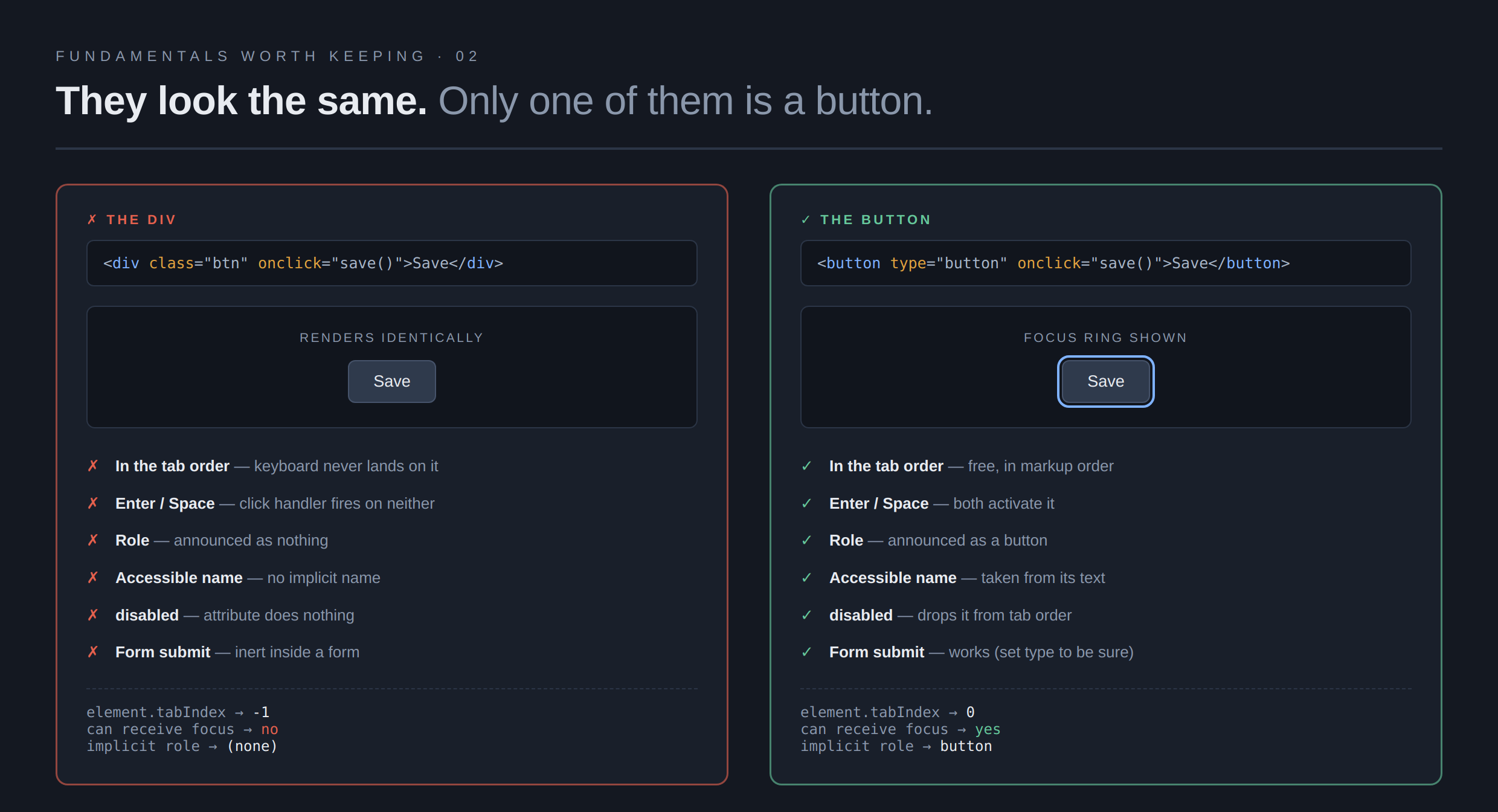
The three lines at the bottom of each panel in that image are not typed in. The page measures
itself when it loads and prints what the browser reports, which is why the div comes back with a
tabIndex of -1 and no role.
Focus you can see
The second thing you see a lot is a focus ring someone removed.
:focus { outline: none; } /* please, no */Somebody does this because the default ring is ugly on their design, and now nobody can tell where they are on the page. Keyboard users navigate by that ring. Taking it away without a replacement is like turning off the cursor.
The fix is to style it, not completely remove it:
:focus-visible {
  outline: 2px solid var(--focus);
  outline-offset: 2px;
}
:focus-visible is the one to reach for. It shows the ring when someone tabs and stays
quiet when someone clicks, which is the behavior people were trying to get when they reached for
outline: none in the first place.
A visible focus indicator is a plain AA requirement and has been for years. WCAG 2.2 added a rule that focus must not be hidden behind your sticky header, also AA, and worth testing, because a sticky bar covering the focused element is easy to miss and very common. The stricter rule about how thick and how contrasting the ring must be sits at AAA, so treat it as a good target to meet. Interactive targets also should be at least 24 by 24 CSS pixels, which is AA and usually a one-line fix.
The order on screen is not the order of the page
This one has burnt me numerous times, and it links straight back to the last article. CSS can move things around. It does not move the reading order or the tab order. Those follow the markup.
.actions { display: flex; }
.primary { order: -1; }     /* looks first, is still second */
Tab through that and you reach the secondary button first, even though the primary one sits on the
left. Same with row-reverse, and same with placing grid items out of source order.
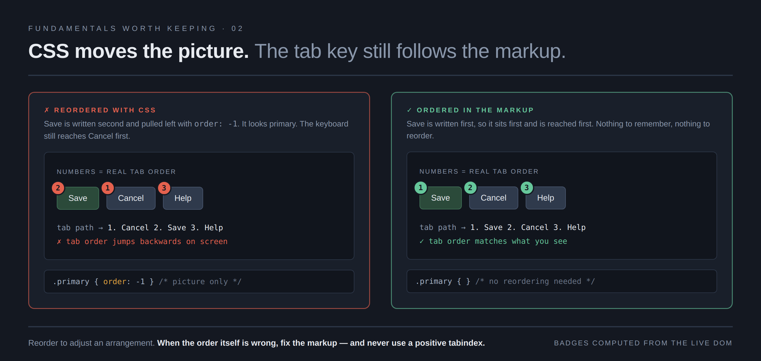
Those badge numbers are read off the live page rather than drawn on. In the left panel Save sits furthest left on screen but carries badge two, because the markup still puts Cancel first, and the page checks its own geometry and reports that the order runs backwards.
Use these to adjust a visual arrangement, and when the order itself is wrong, fix the markup. If you find yourself reordering heavily to get the layout you want, the markup is probably in the wrong order to begin with.
tabindex above zero always causes trouble
3 values, and only 2 of them are a good idea to use.
tabindex="0"puts a custom element in the natural tab order, in markup order - Good.tabindex="-1"takes it out of tab order but lets you move focus there from script, which is what you want for a dialog you have just opened - Good.tabindex="3", or any positive value, jumps that element to the front of the whole page, ahead of everything with 0. Add a few of those across a codebase and the tab order becomes a puzzle nobody can predict. Recipe for disaster.
I have never seen a positive tabindex that was not a mistake. If something needs to
come earlier, move it earlier in the markup.
Labels, headings, landmarks
Three smaller habits that come with a big payoff.
Tie labels to inputs. A placeholder is not a label. It vanishes the moment someone types, it fails contrast on most designs, and screen readers treat it inconsistently.
<label for="email">Email</label>
<input id="email" type="email">
The for must match the id. Do that and clicking the word focuses the
field too, which helps everyone.
Use headings as an outline, not as sizes. Pick h1 through
h6 by rank, then style them. Screen reader users jump between headings to find their way,
so skipping from h1 to h4 because the smaller one looked right leaves holes
in the map. If you want a large h3, that is a CSS problem.
Wrap the page in landmarks. header, nav,
main, footer. 4 elements, and they let people jump straight to the
content. main in particular is what a skip link should point at.
What the tab key finds in 30 seconds
Walk any page you have shipped recently and look for 5 things:
- Can you reach every control? Anything you skip past is a div that should be a button.
- Can you see where you are on every stop? If the ring disappears, someone removed it.
- Does the order make sense, roughly following the page? If it jumps around, check for
order, reversed containers, or a positivetabindex. - Can you activate everything with Enter, and buttons with Space?
- Once you open a menu or dialog, can you get out again with ESC, and does focus go somewhere sensible rather than back to the top?
That last one is the most common failure seen in AI-written code, and it is invisible until you try it.
Asking an agent for this
The pattern from the last piece is a good example. A vague ask gets you the div.
Vague:
Add a dropdown menu to the header.
Specific:
Build the menu with a real
buttonfor the trigger and auloflifor the items. Trigger getsaria-expandedandaria-controls. Open on click and on Enter or Space. Escape closes it and returns focus to the trigger. Arrow keys move between items. Style focus with:focus-visible, neveroutline: none. No positivetabindex. Targets at least 24 by 24 pixels.
6 sentences, and every one of them is something you would otherwise have to find and fix. This is the same as before: knowing the standards lets you ask for them directly, instead of approving what comes back and hoping.
And when it does come back, walk it with the tab key. It takes half a minute and it catches what nothing else will.
Next in this run: the cascade and specificity, why the style you wrote is not the style that won.