How to Choose Between Flex or Grid
Part 1 · Frontend Fundamentals
Every guide opens the same way. Flex is for one dimension, grid is for two. I have written that line myself and I now think it does more harm than good. People build single-row grids every day and they are right to. The line sounds like a rule and works like a riddle.
There is a better question, and it is the one I ask before I write either word.
Who decides the sizes: the content, or me?
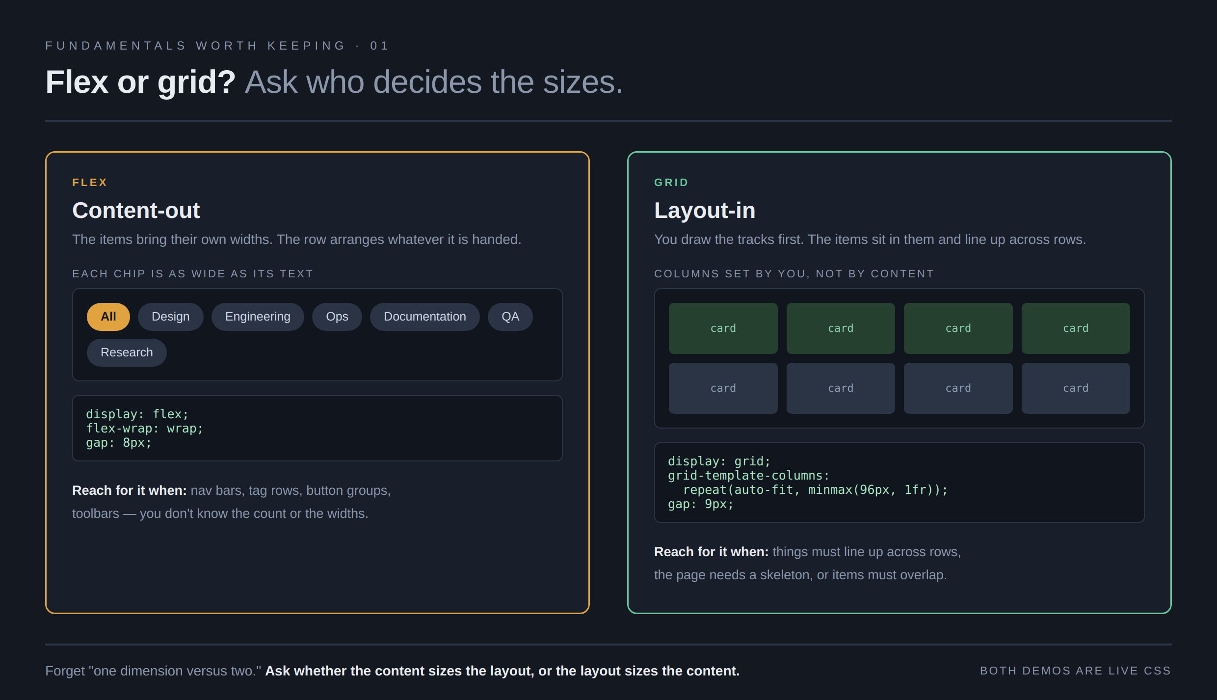
Flex works content-out. Each item brings its own width and the row arranges what it is handed. That is what you want for a nav bar, a row of tags, a button group, a toolbar, anything where you don't know in advance how many items there are or how wide each one runs.
Grid works layout-in. I draw the tracks first and the items sit in them. That is what you want when things must line up across rows, when the page needs a fixed skeleton, or when two items have to overlap.
Say it out loud with a real case and the answer usually falls out. A row of filter chips? The chips know their own widths, and there could be three or thirty. Content-out. Flex. A card grid where every card must share a column edge with the card two rows down? I decide the columns. Layout-in. Grid.
That is the whole mental model. The rest of this piece is the small print that makes it work, and why it is worth knowing even if an agent writes most of your CSS.
Why bother, if the agent writes it
Because you cannot ask for what you cannot name. "Make the cards responsive" is a wish. The agent fills it with something that works on the screen it tested and falls apart on yours: three nested wrappers and four breakpoints. Ask for a grid with a minimum column width of 280 pixels that wraps on its own, and you get four lines that need no breakpoints at all. Same agent, same model. The only thing that changed is that you knew what to ask for.
The other half is reading. Agents learned from years of blog posts, and much of that advice has aged. When a diff comes back with margin hacks for spacing between flex items, I want to know at a glance that it is copying a workaround from 2018. You can only catch that if you know what the current tool does.
Five things that trip people up
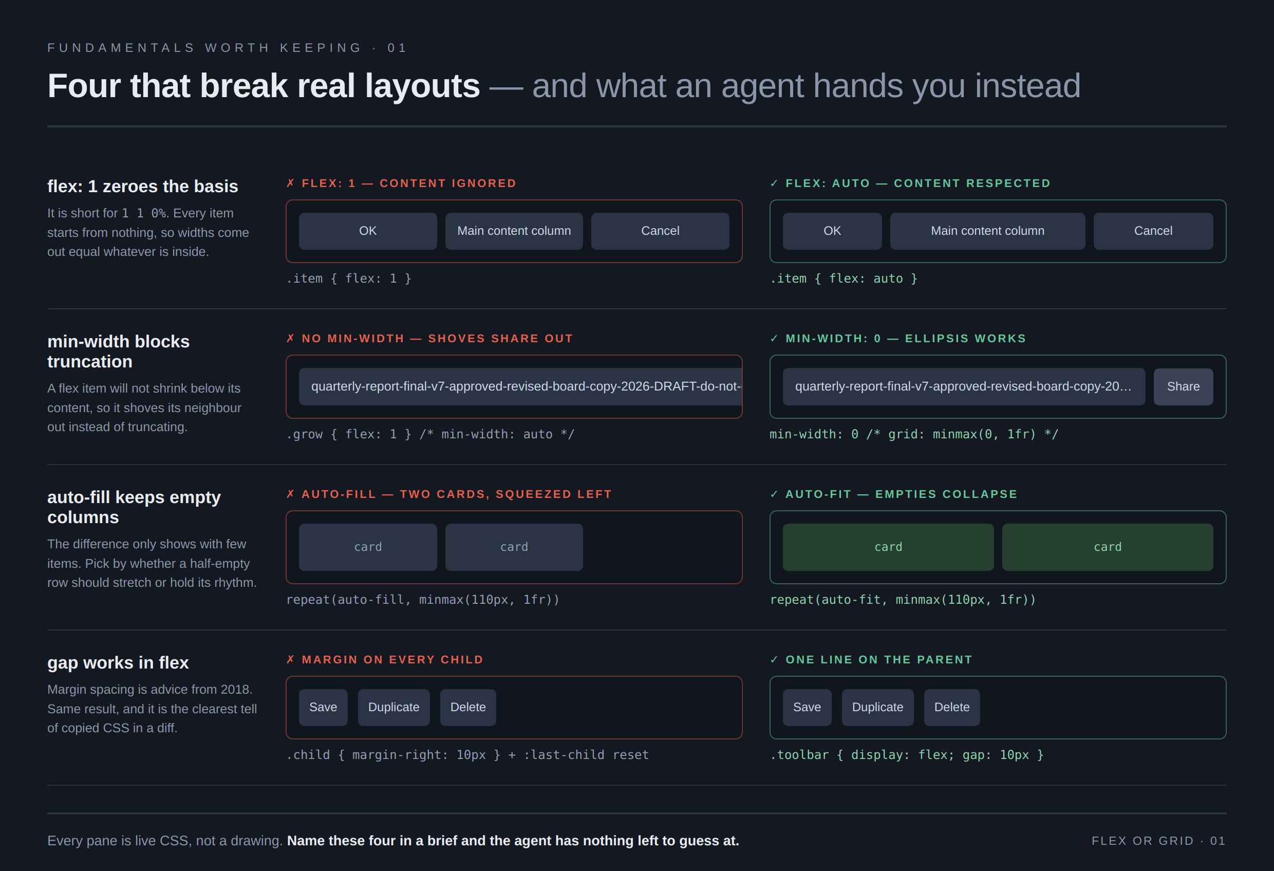
These are the ones I see break real layouts, and the ones agents get wrong most often. Four of them are below in a side-by-side, broken on the left and fixed on the right. Every pane is live CSS rendered in a browser, so the widths you see are the real behavior, not a drawing of it.
flex: 1 is not "share the space"
Most people read flex: 1 as fair shares of what is left over. It does more than that.
It is shorthand for flex: 1 1 0%, and that last part sets each item's starting width to
zero. Every item then grows from nothing, so they all come out the same width no matter what is inside
them.
.item { flex: 1; }      /* equal widths, content ignored */
.item { flex: auto; }   /* = 1 1 auto; wider content gets more room */
If your columns are equal and you wanted them to reflect their content, this is why. Reach for
flex: auto. Most "why is my sidebar the same width as my main column" bugs are this
line.
Your item won't shrink, and min-width is why
A flex item has a floor you never wrote. It will not shrink below the width of its own content, so instead of truncating, a long filename shoves the button next to it clean off the edge.
.item {
  min-width: 0;         /* let it shrink */
  overflow: hidden;
  text-overflow: ellipsis;
  white-space: nowrap;
}
There is a wrinkle worth knowing, because it explains why this bug seems to come and go. That
floor only applies when the item is not itself a scrolling box. Give the item overflow:
hidden and the floor drops to zero on its own, which is why the block above works even without
the min-width line. Keep the line anyway. The moment you nest one flex container inside
another, the outer one has visible overflow, the floor comes back, and you will spend an hour hunting
it.
Grid has the same trap and the same cure. 1fr means minmax(auto, 1fr),
and that auto is the same floor. Use minmax(0, 1fr) when a track must be
allowed to shrink.
.grid { grid-template-columns: minmax(0, 1fr) 300px; }I hit this one again while building the second image for this article. A demo of the broken layout
was wide enough to stretch its own grid column and push the whole card off the page. The fix was
minmax(0, 1fr) on the row.
auto-fit and auto-fill are not the same
This is the pattern worth memorizing, because it gives you a responsive card grid with no breakpoints:
.cards {
  display: grid;
  grid-template-columns: repeat(auto-fit, minmax(280px, 1fr));
  gap: 24px;
}
Swap auto-fit for auto-fill and the difference only shows when you have
few items. auto-fill keeps the empty columns and your two cards sit squeezed on the left.
auto-fit folds the empty ones away and the two cards stretch across. Neither is wrong.
Pick auto-fit when few items should fill the row, auto-fill when the column
rhythm should hold even when the row is half empty.
gap works in flex
For years the advice was that spacing between flex items meant margins, and a negative margin on
the parent to cancel the outer edge. That advice is dead. gap has worked in flex for a
long time now.
.toolbar { display: flex; gap: 12px; } /* that is the whole trick */I keep this one on the list because it is the clearest tell of copied advice. If an agent hands me
a diff with margin-right on every child and a negative margin on the wrapper, I know
where it learned that, and I ask for the current tool by name.
Reordering moves the picture, not the page
order, row-reverse, and grid placement all move things on screen. None of
them change the order a screen reader reads, or the order the tab key walks. Move a button to the end
with order: 99 and a keyboard user still reaches it first.
Use them to adjust a visual arrangement. When the reading order itself is wrong, fix the markup.
Two newer tools worth knowing
Both are safe to use now, and both replace things people still write scripts for.
Subgrid lets a child grid borrow its parent's tracks. The everyday use: three cards side by side, each with a title, some text, and a button, and you want the buttons to line up across all three even though the titles run to different lengths. That used to mean fixed heights or a script. Now the card inherits the row tracks and the parts line up on their own. It reached the "safe to use everywhere" mark in March 2026.
.card { display: grid; grid-row: span 3; grid-template-rows: subgrid; }Container queries size a component by the width of its own container instead of the browser window. This is the one that changes how you build things you reuse. The same card can sit in a narrow sidebar and a wide main column and lay itself out correctly in both, with no knowledge of the page around it.
.card-wrap { container-type: inline-size; }

@container (min-width: 400px) {
  .card { grid-template-columns: 120px 1fr; }
}
One to leave alone for now: native masonry, the staggered layout where items pack up into the gaps. The working group has settled on reusing grid's placement properties for it, but as of early 2026 it is still experimental across browsers and the naming is still being argued over. Watch it. Don't ship it yet.
What this buys you when you brief an agent
Here is the same job asked two ways.
Vague:
Make the card list responsive.
I have got back three nested flex wrappers, four breakpoints, and a fixed height to force the buttons to line up. It worked on the reviewer's screen.
Specific:
Use a grid:
repeat(auto-fit, minmax(280px, 1fr)), 24px gap, no media queries. Each card is a subgrid spanning three rows so titles, text, and buttons line up across cards. Wrap it in a container query context and switch the card to a two-column layout above 400px. No fixed heights.
That is four sentences and it names every decision. The agent has nothing left to guess at, and I can check the result by reading five lines instead of fifty.
You do not need to know every property to write a brief like that. You need to know the handful of things that decide the shape: who sizes the items, what the minimum column is, whether the parts must line up across siblings, and what the component should respond to. Learn those and you can direct the work. Skip them and you are approving whatever comes back.
Next in this run: semantic HTML and focus order, the part agents skip most often, and the easiest to check.